BROADCAST IDENTITY
RTP Newscasts Rebrand | Openers
Reimagining the Visual Identity of RTP’s News Division.
—
Reimagining the Visual Identity of RTP’s News Division.
—
Itsanashow Studio invited me to help them reimagine the motion system for parts of RTP’s news division. RTP is a Portuguese public broadcaster, and this rebrand goes far beyond a visual refresh. It redefines how trust, clarity and authority are communicated on screen, a crucial challenge in a landscape increasingly shaped by fake news and AI-driven media.
Rooted in the principles of transparency, objectivity and credibility, the new identity reimagines how trust appears and moves on screen. It bridges editorial precision with cinematic motion, creating a design language that is clear, confident and human — elevating the role of public-service journalism through design.
In close collaboration with RTP’s in-house team, the project became part of a broader restructuring, aligning direction, studio set design and on-air presence under a renewed commitment to public service.
Our approach combined broadcast storytelling, editorial systems thinking and UI-driven motion cues to build a future-proof visual language. A unified system where brand, motion and editorial strategy operate as one, strengthening RTP’s news ecosystem across every channel and every format.

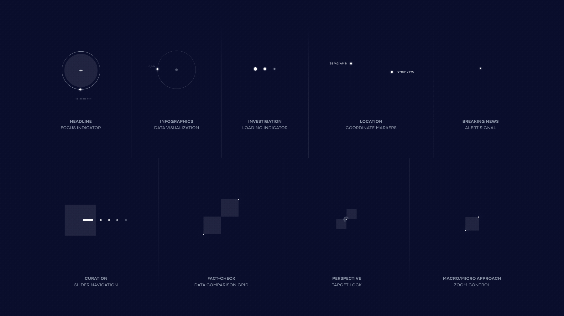
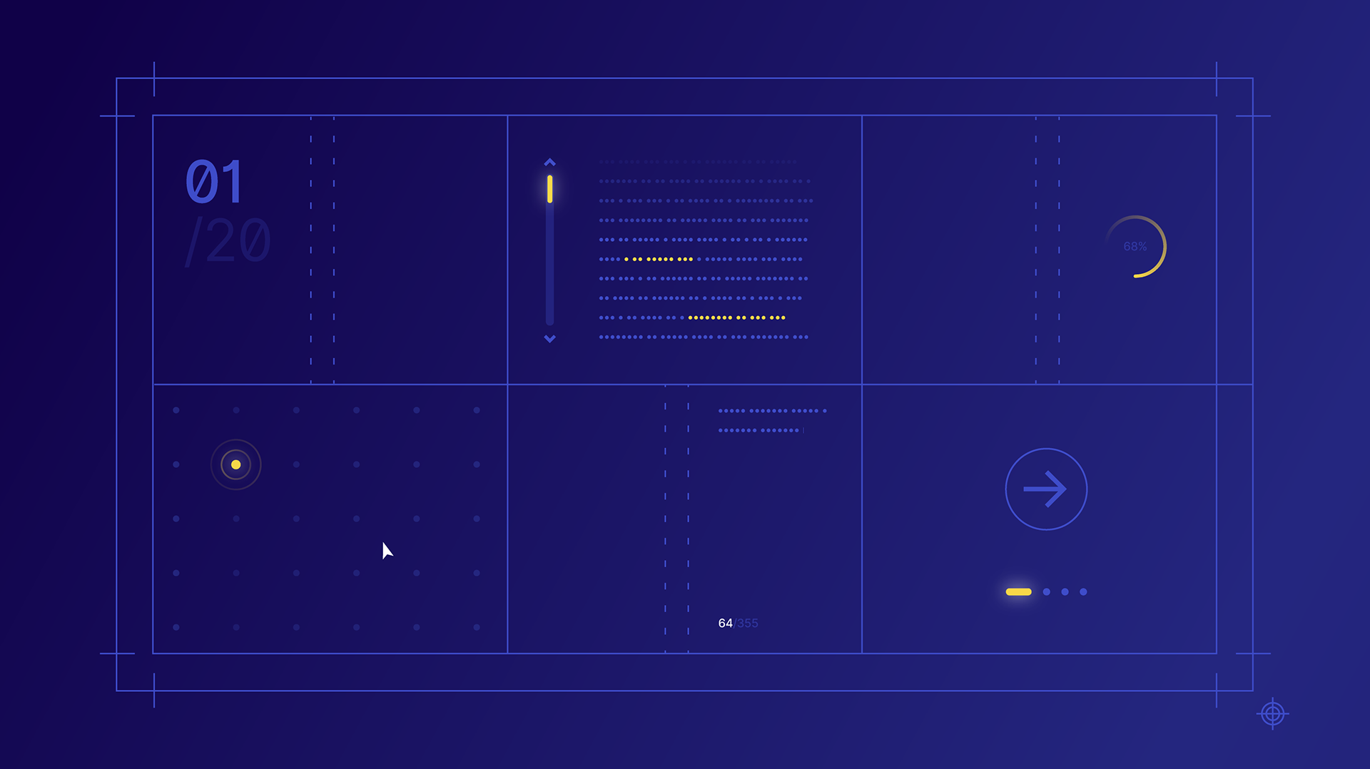
Microanimations
—
We created a set of microanimations that connect digital UI behaviors with journalistic actions, from headline focus and investigation loaders to coordinate markers and data cues. Each gesture becomes part of a shared, intuitive motion vocabulary that mirrors newsroom workflows and strengthens the overall editorial rhythm.
I was responsible for animating all the microanimations.
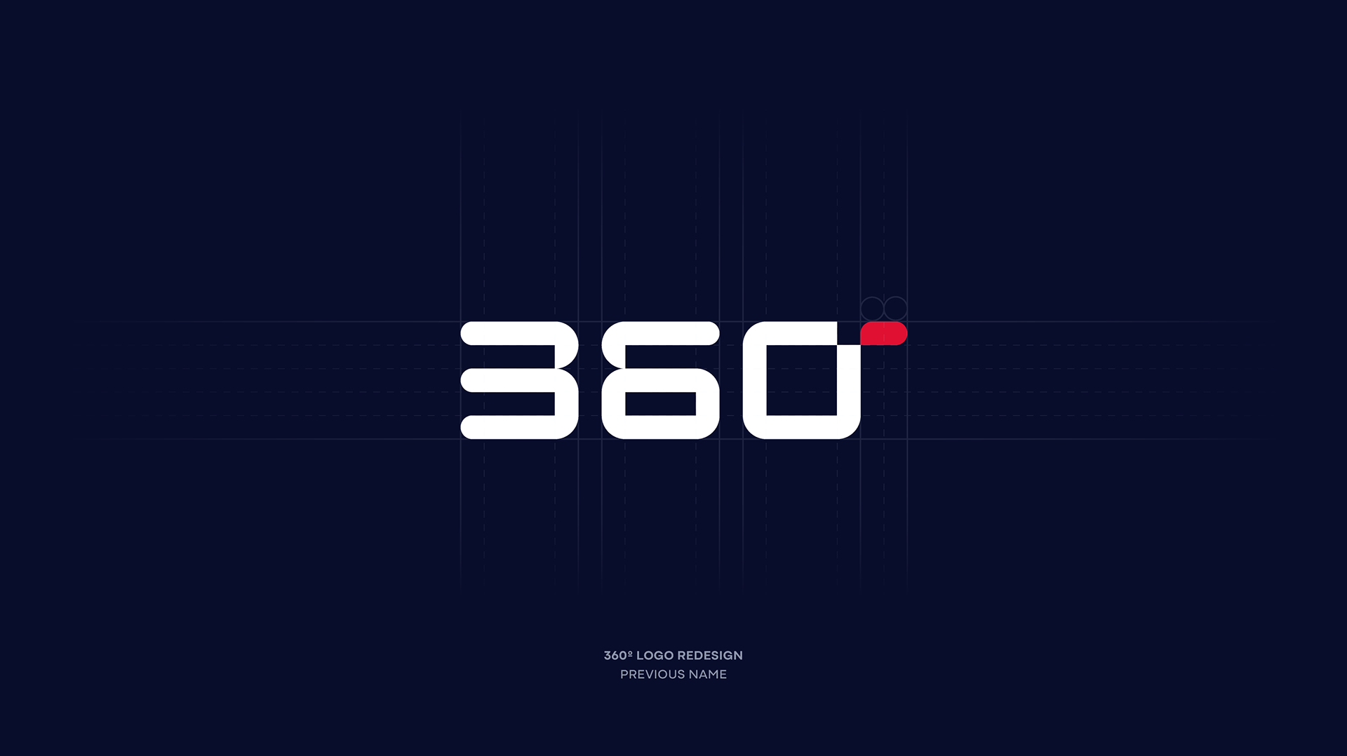
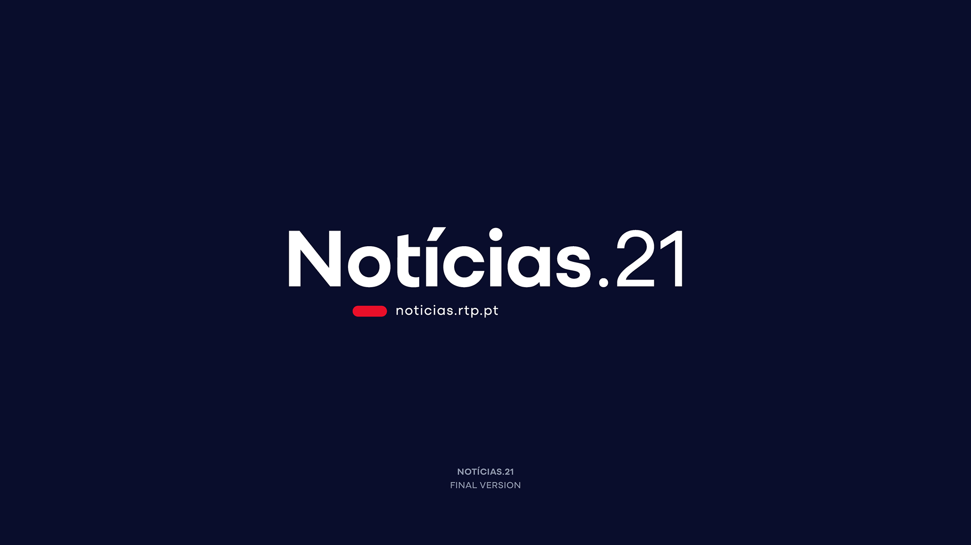
Notícias.21 (formerly 360)
—
Minimal, digital, and distinctly nocturnal, this opener builds an intimate yet analytical tone for late-night conversations. A single beam of light cuts through the void, revealing a modular, data-driven grid in constant transformation, echoing the feeling of real-time information analysis. Deep nocturnal tones reinforce a mood that is focused, modern, and unmistakably prime-time.
I was responsible for all the animation from [00:02] until the end, except the “Notícias.21” lettering.


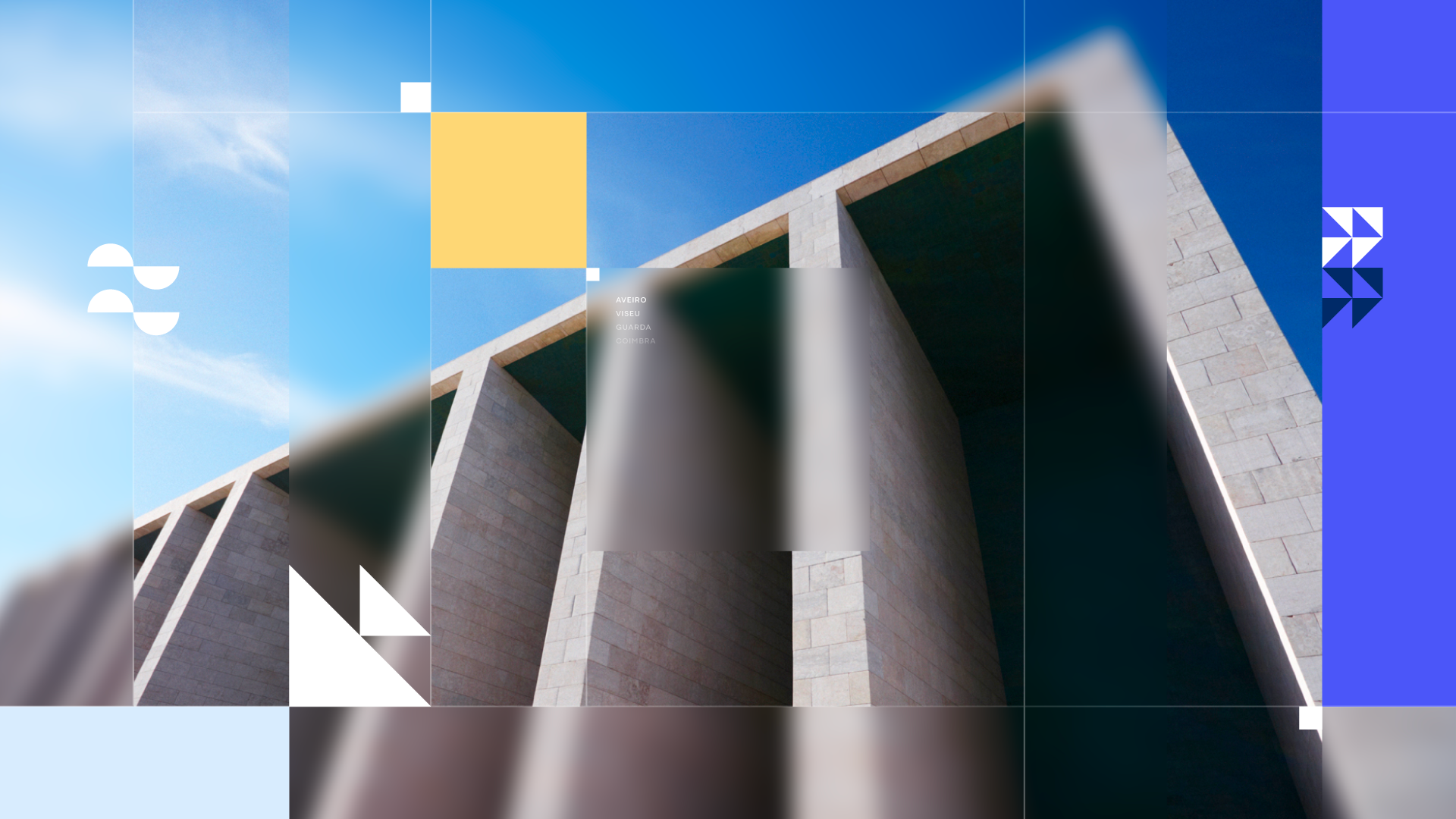
Portugal em Direto
—
A human, culturally rich opener inspired by Portugal’s textures, patterns, and materials. Azulejo motifs, warm colors, and footage ranging from tourism to industry, paired with dynamic transitions, honor regional stories while keeping them connected to the broader RTP identity. Local in spirit, national in structure.
I was responsible for all the animation, from beginning to end.
I was responsible for all the animation, from beginning to end.


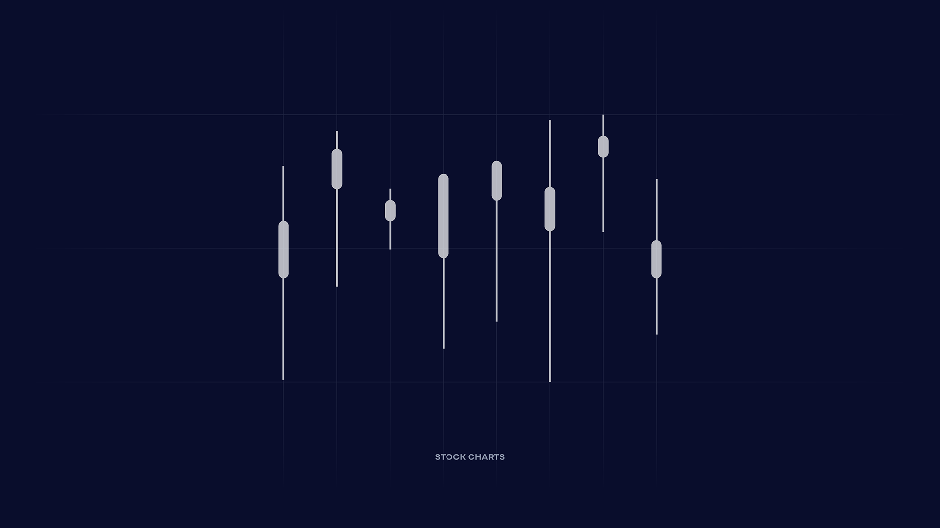
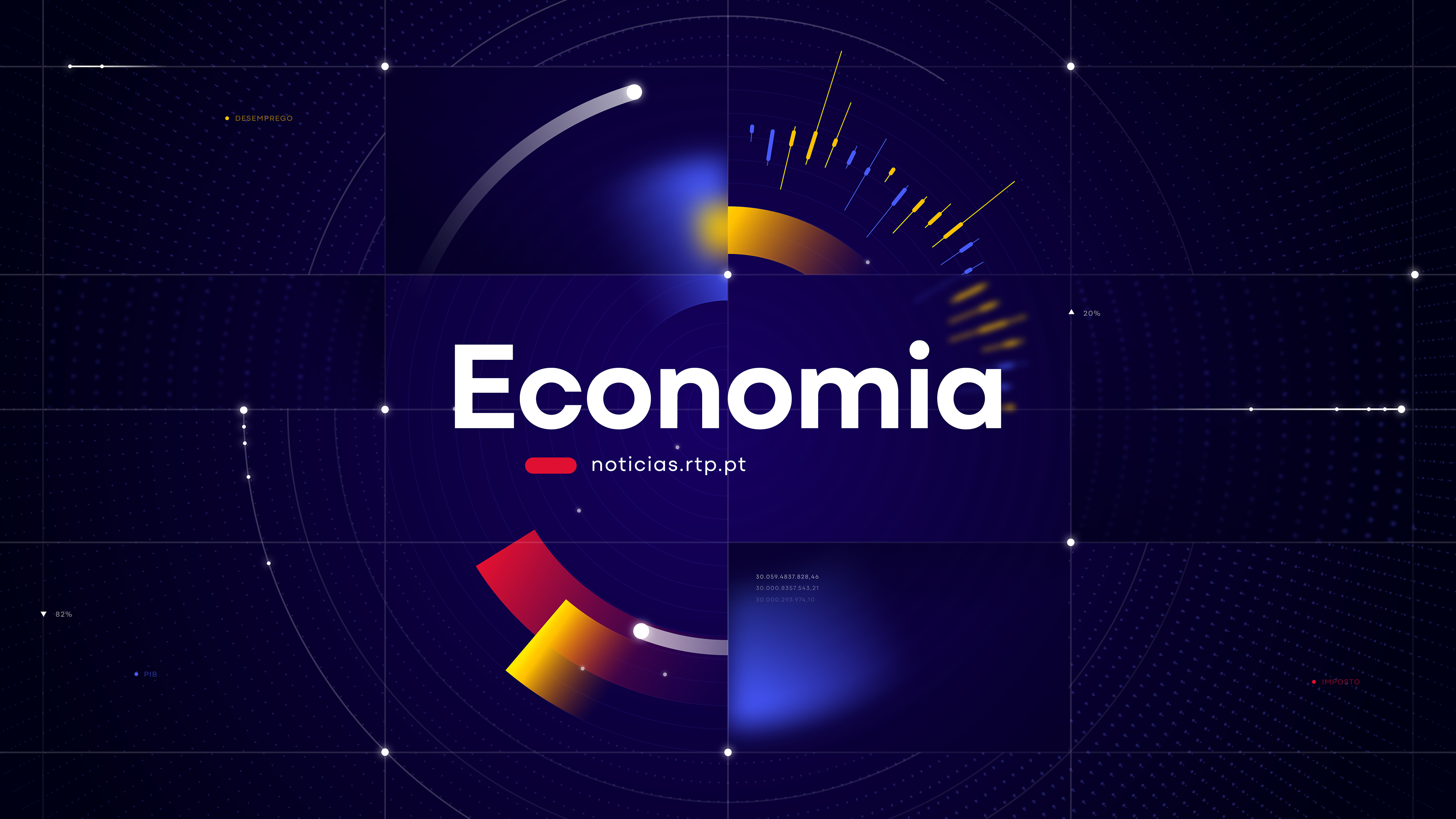
Economia
—
A bold, data-driven visual identity inspired by graphs, stock movements, and financial metrics, reinforced by intentional and meaningful use of color.
I was responsible for all the animation, except for the circles bouncing at the start and the small dots on the background.
I was responsible for all the animation, except for the circles bouncing at the start and the small dots on the background.

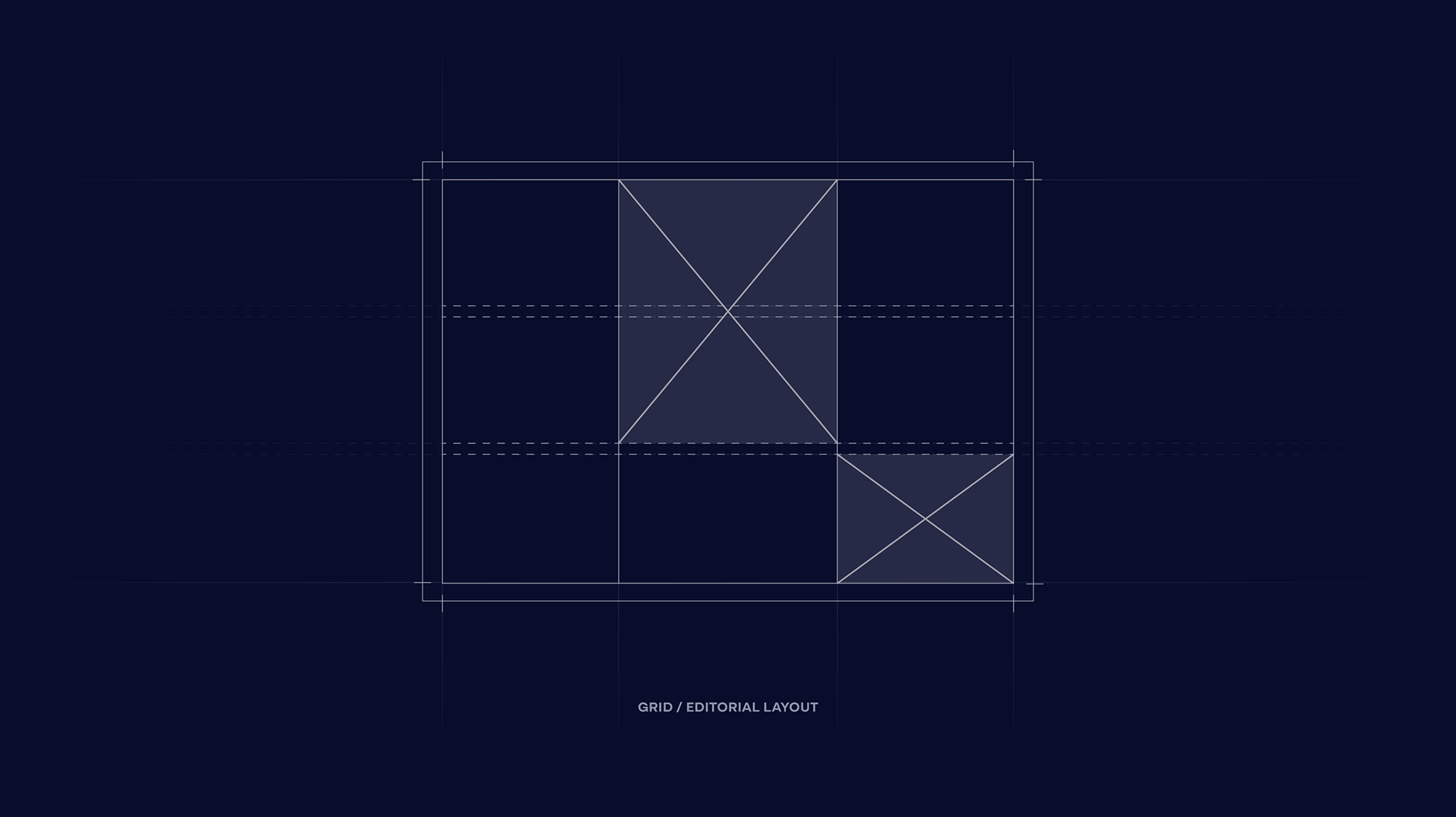
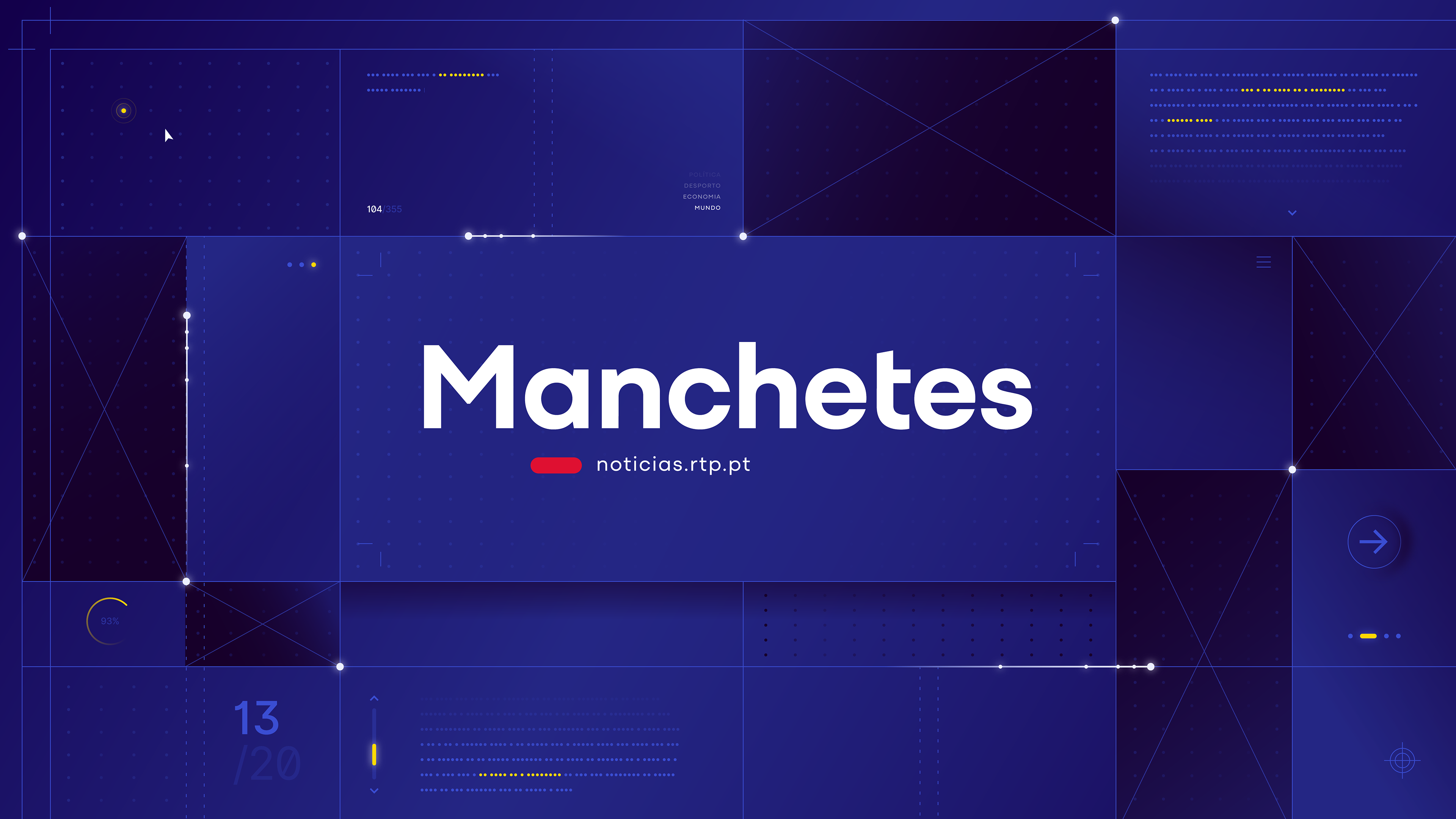
Manchetes
—
This opener translates the structure of printed journalism into a modern broadcast framework. Typography, layout blocks, and blueprint-inspired compositions create a clean and editorial environment where information feels curated, organized, and authoritative. A minimalist tribute to the foundations of news design.
I was responsible for all the animation, from beginning to end.
I was responsible for all the animation, from beginning to end.
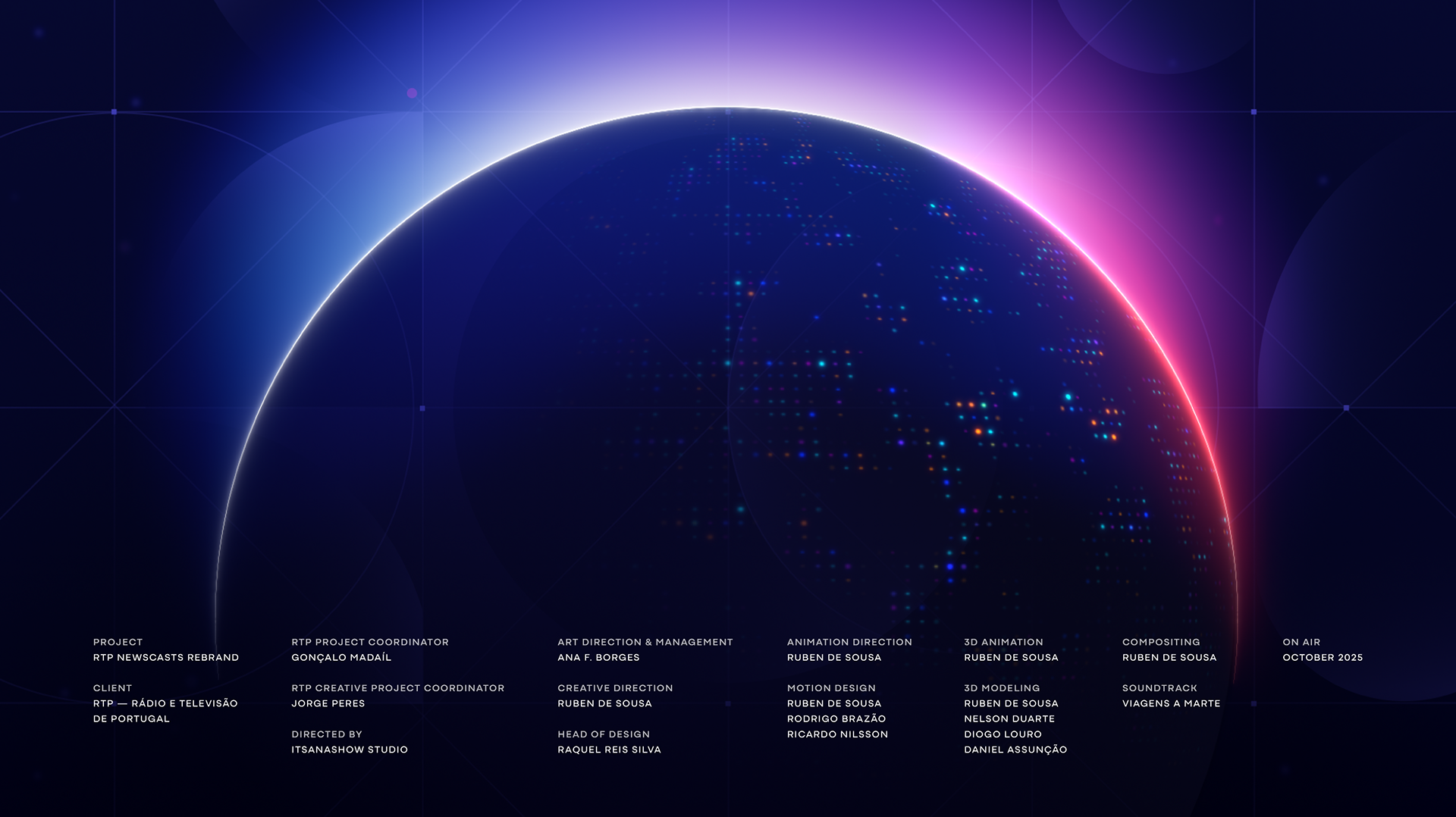
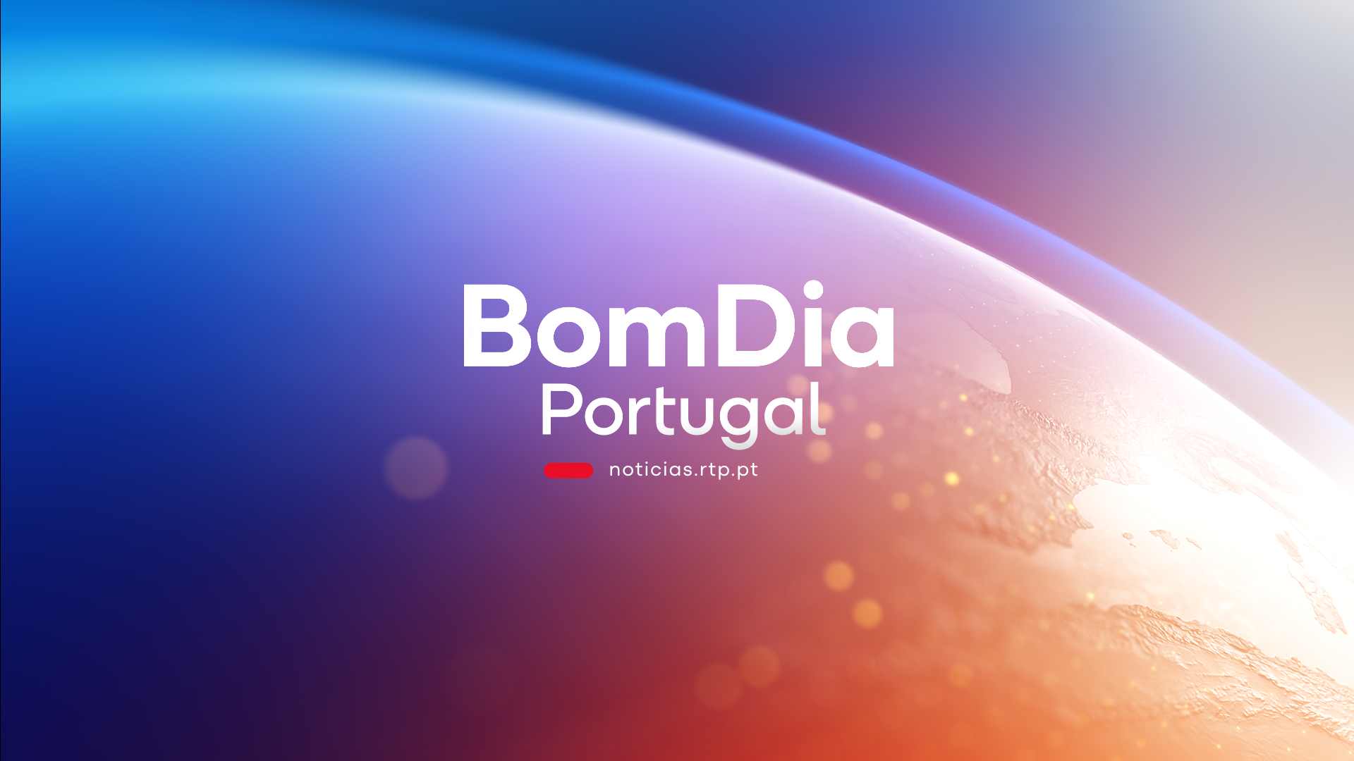
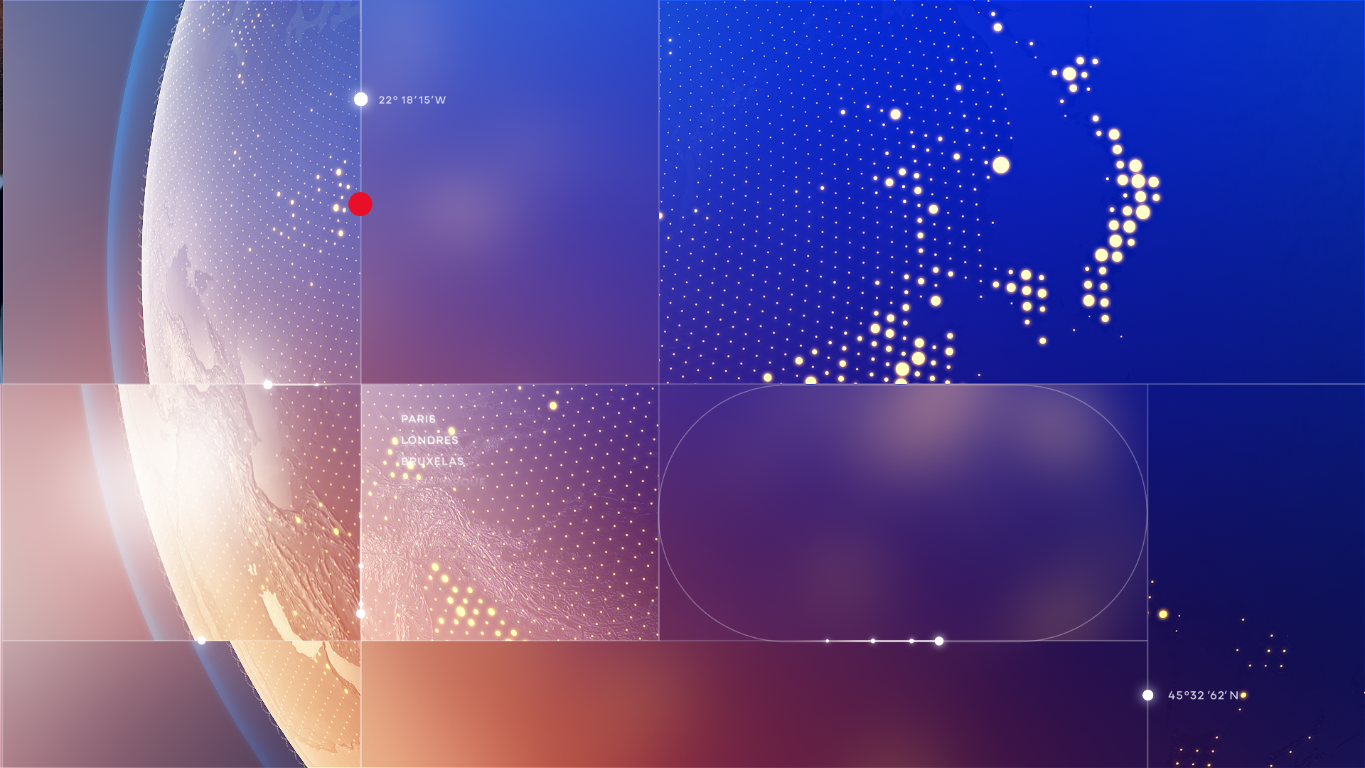
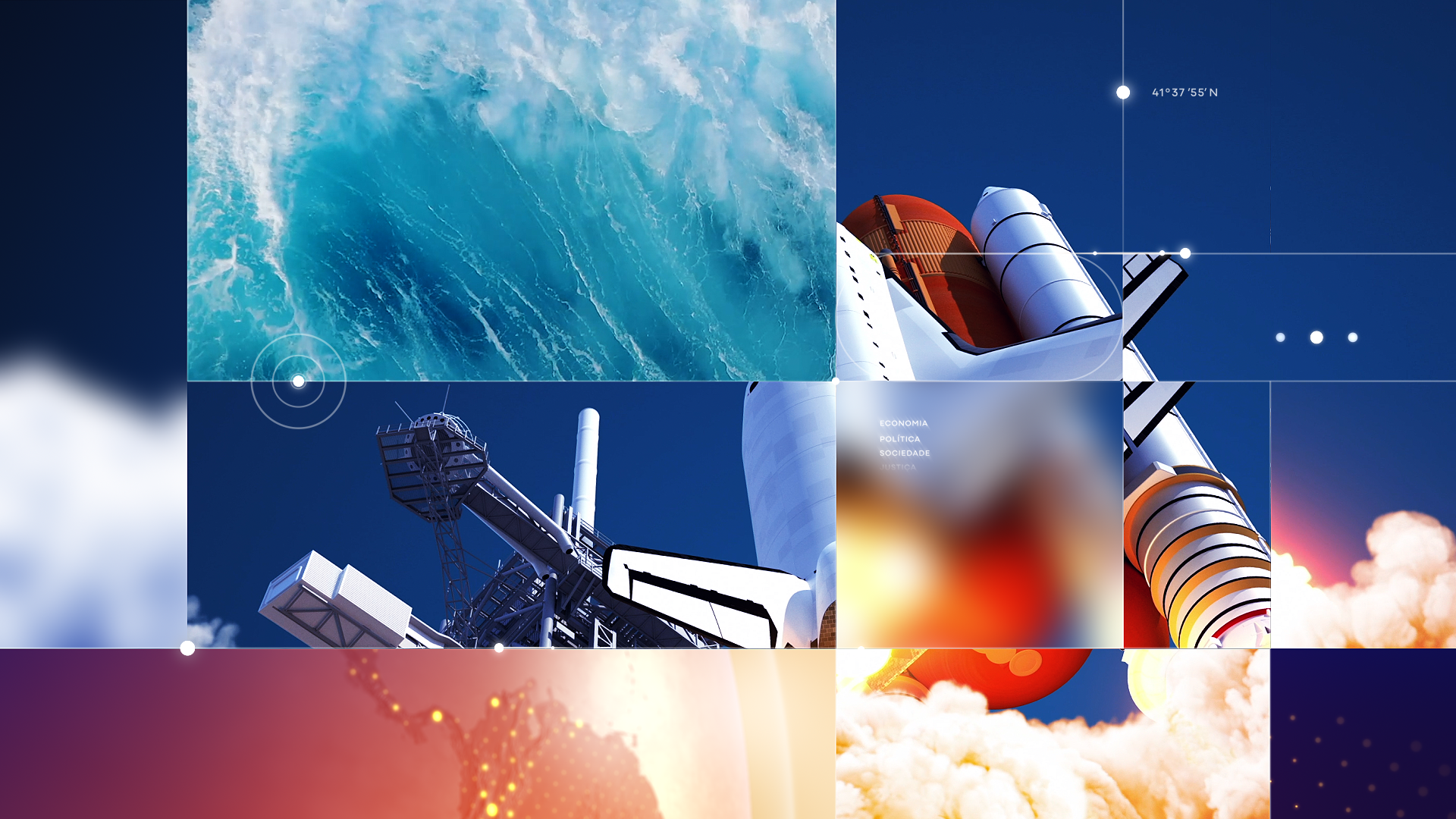
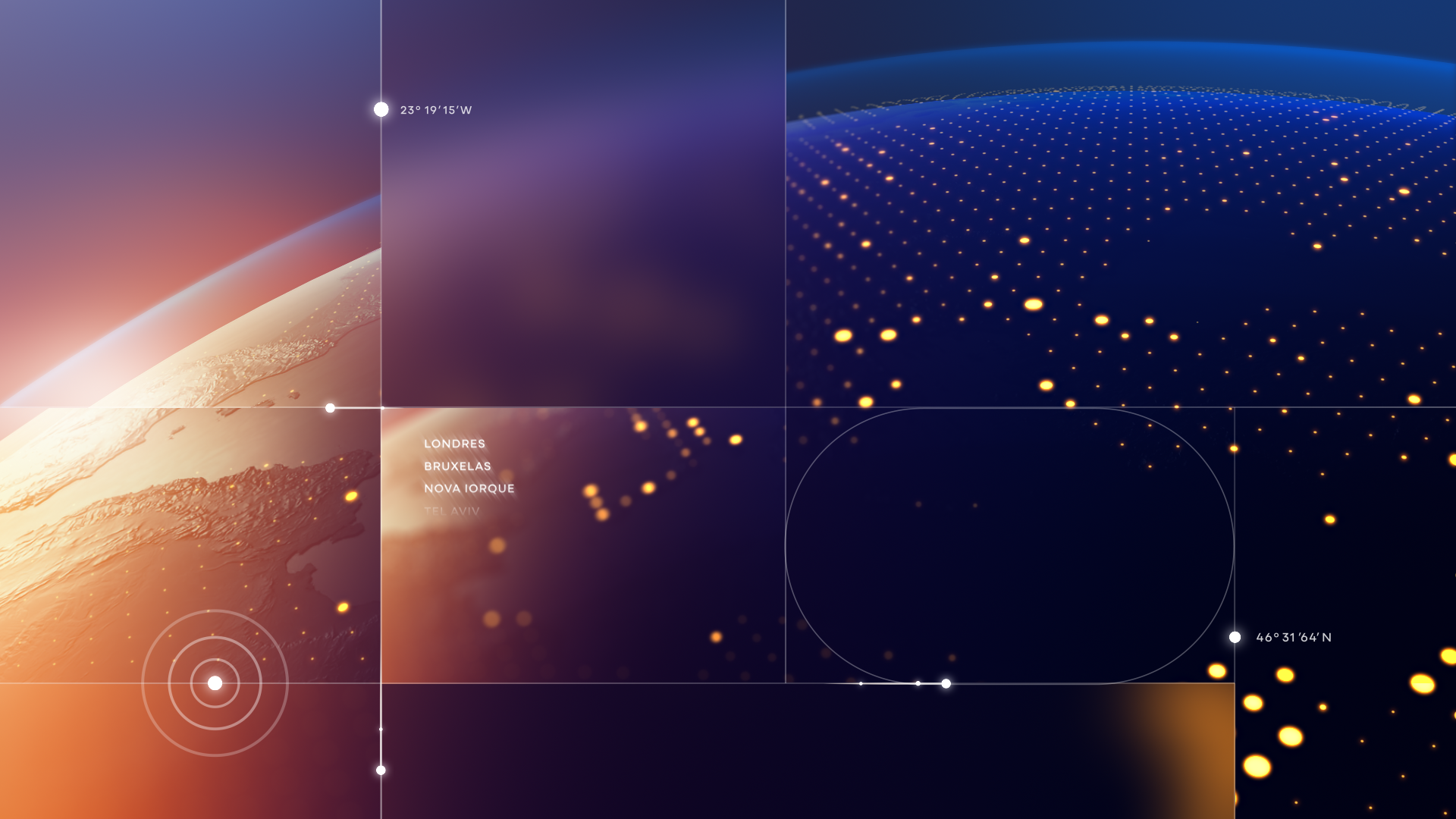
RTP1 & RTP2
—
These flagship openers bring real-world footage back to center stage, blending live imagery seamlessly with a responsive motion grid and a cinematic 3D globe. This visual direction reinforces RTP’s historic authority as a national news source. Structured, coherent, and unmistakably RTP, these openers set the tone for the entire family through strong compositions, layered depth, and a clear editorial structure.
I was responsible for all the animation from [00:09] to [00:14].
I was responsible for all the animation from [00:09] to [00:14].


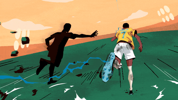
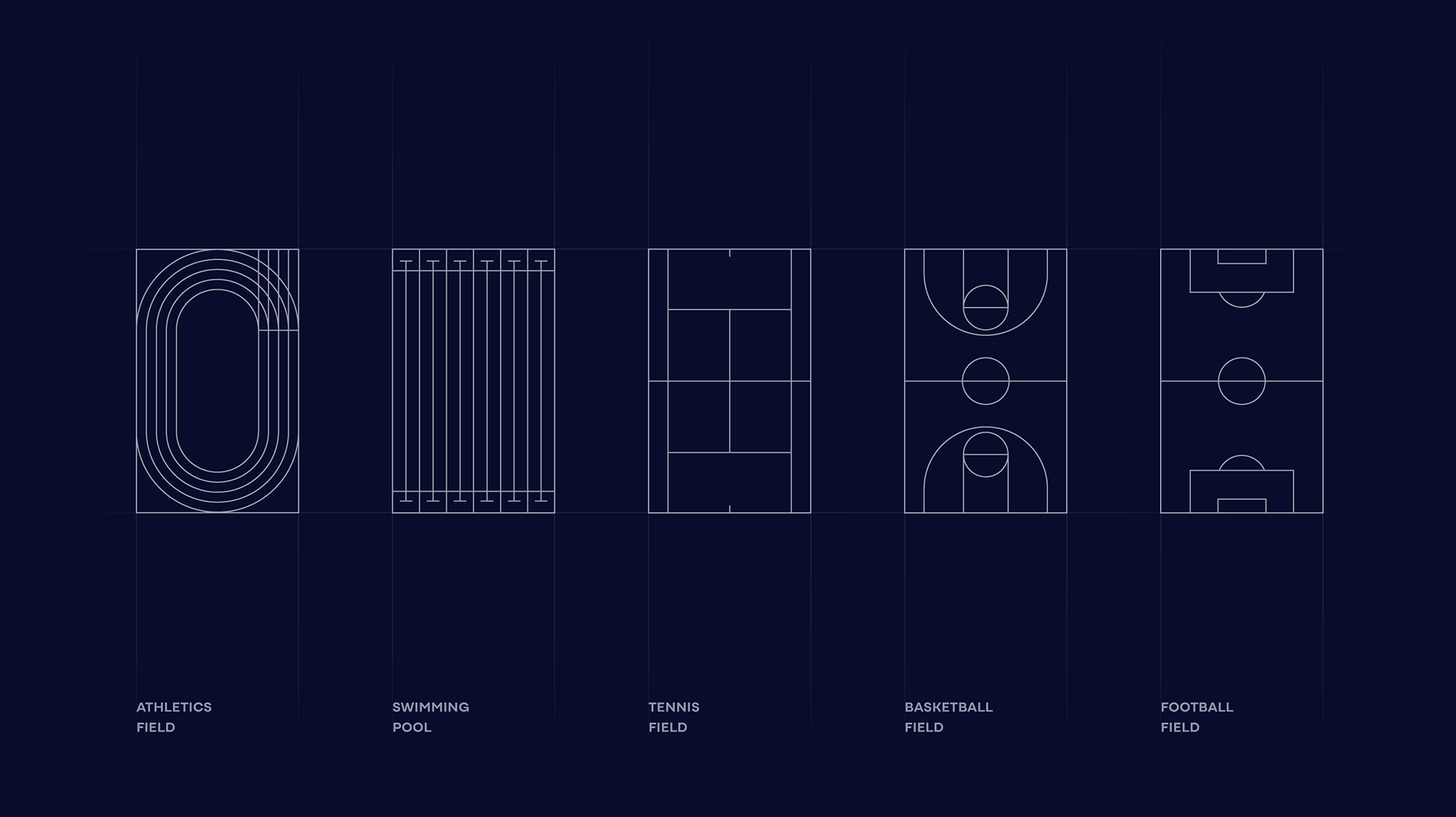
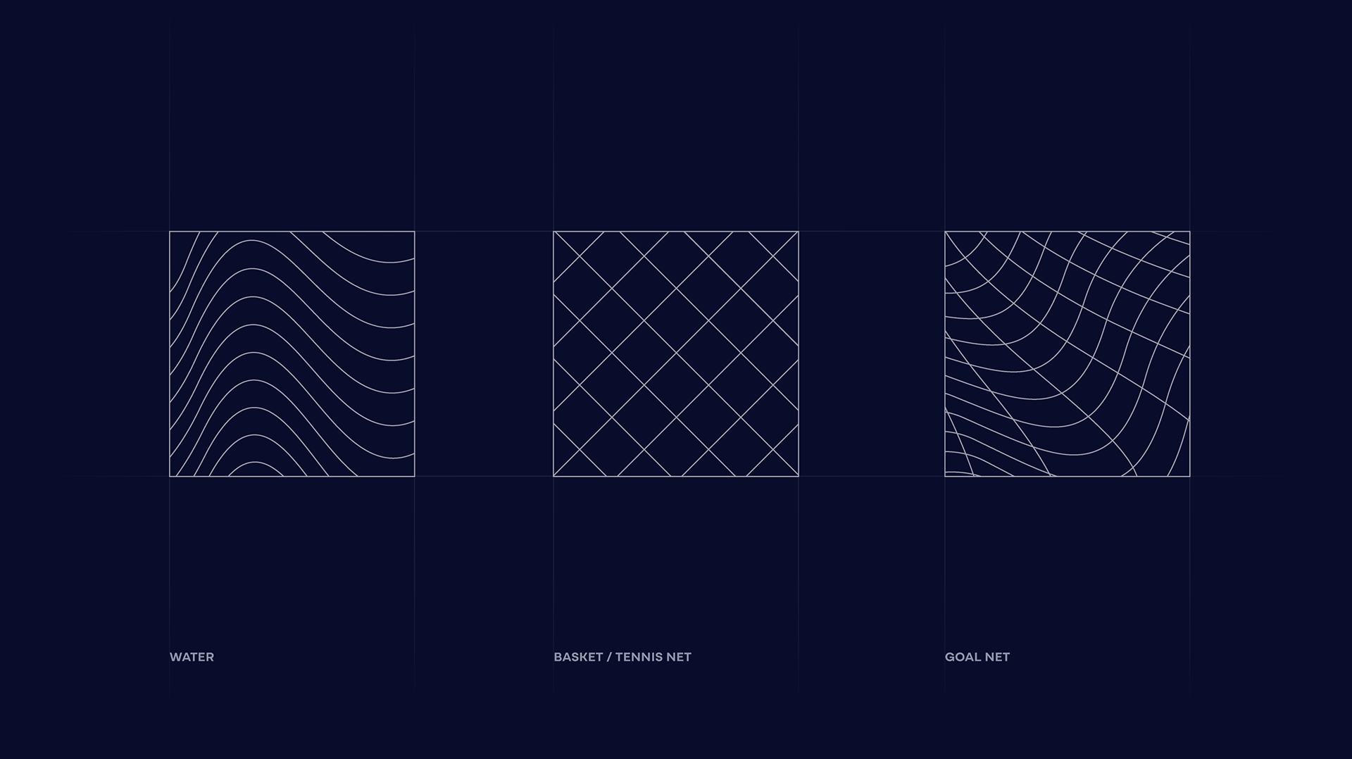
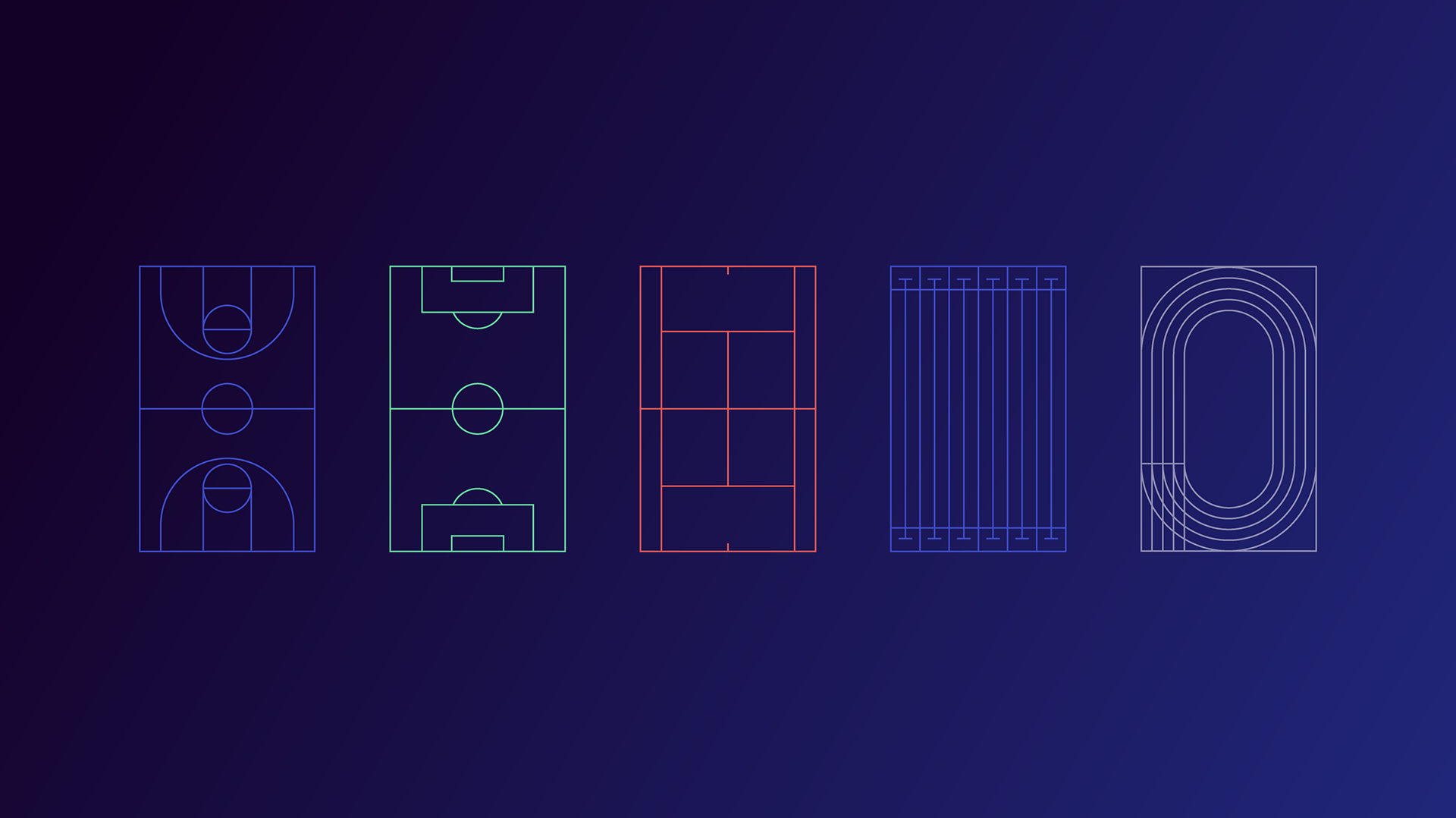
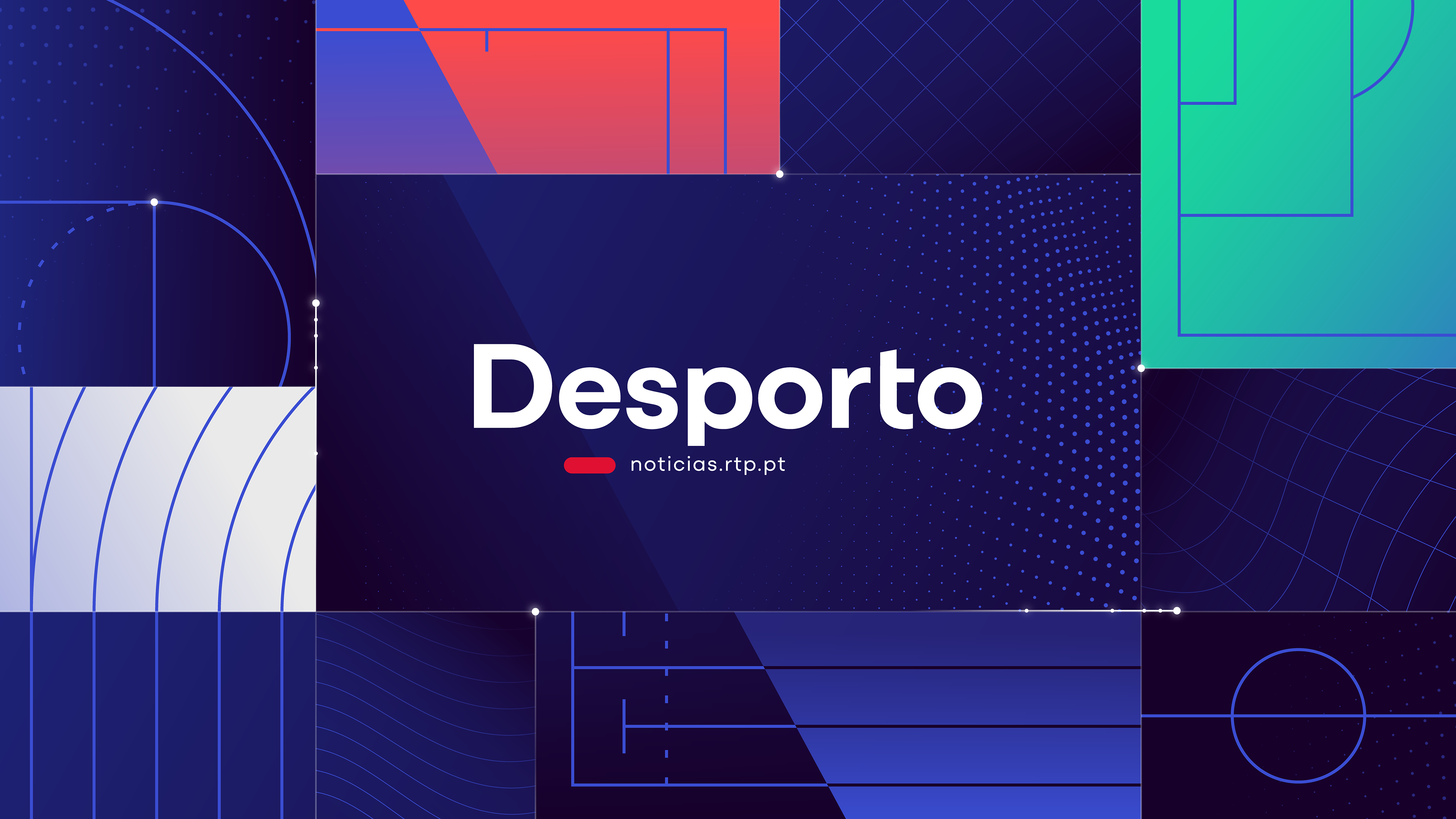
Desporto
—
Energetic, vibrant, and dynamic, this opener uses minimal sports-inspired patterns and a responsive grid referencing fields, courts, and competitive movement.
I was responsible for all the animation, except for the small blue dots in the background, the last transition, and the perspective grids waving at the end.
I was responsible for all the animation, except for the small blue dots in the background, the last transition, and the perspective grids waving at the end.
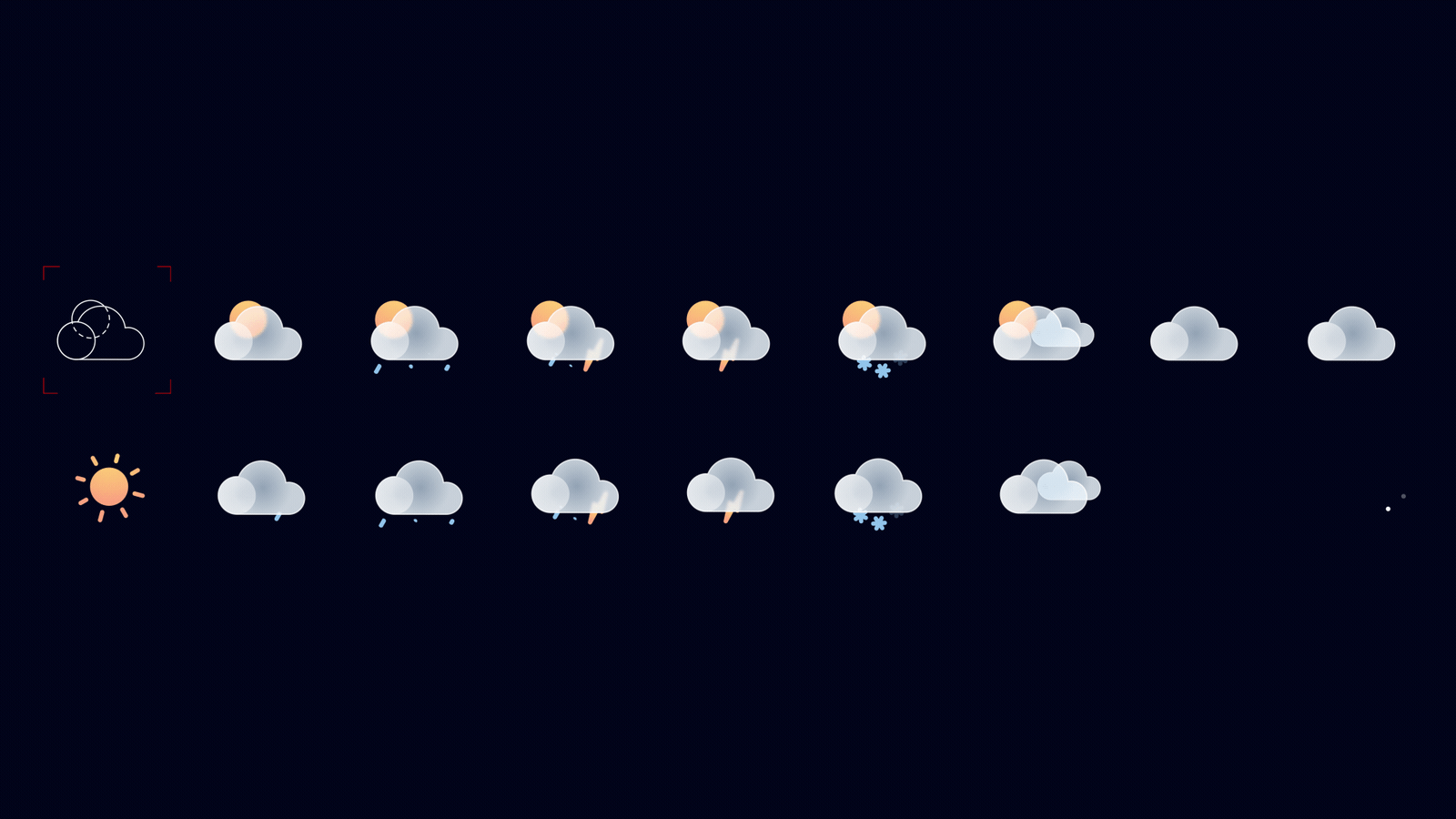
Meteorologia
—
A translucent, glass-like sphere where light and color shift gently. Wind lines form inside it, suggesting an environment in constant transformation. A multi-layered visual grid defines the world of meteorology.
I was responsible for all the animations.